Bringing back my website in an attempt to use it as the base for future updates. Still a work in progress. Comments?
Last Updated
MapIn honor of St. Patrick’s Day, I’ve loaded my copy of Saints and Tzadiks for playing. Nothing like what happens when a Yiddish and Irish folk singer team up.
Decided to watch the 1994 movie, Radioland Murders. A 19% on Rotten Tomatoes. It was admittedly a farce…but it being over the top was the point.
david.shanske.com is shaping up. Divided the content into two pieces: Articles and Notes. Notes are similar to tweets/status updates. Articles are longer.
This evening, I dwelt(or at least got gas) in the Land of Goshen(New York). I am now ready to recount the exodus from Egypt.
Looking for feedback on this site. Doing some tests to see if I can pull in comments from the major social networks. I’m not the best website designer.
One of the next things I need to work on for my site is the formatting for sharing photos.
Starting in a week, I will be without bread due Passover. Trying to figure out the best food to buy and devour right afterward.
I’ve Joined the Indieweb Movement
Those of you following me on various networks may have noticed a flurry of different types of posts coming through. Taking a moment to explain this.
I recently learned about the Indieweb movement. Their philosophy is based on the idea that you publish on your own site and syndicate elsewhere. This matches up with the philosophy I currently have.
This site, david.shanske.com, has been here for a while, not doing much, and I’ve decided to try and adopt the Indieweb concept and use it as a place to distribute to all of the various social networks. I also want to get into sharing more, and am making an effort to add content/value.
I’m still working on the formatting a bit. So, there will be some changes to site appearance as I play with the site appearance and organization.
The site currently offers multiple different types of content:
- Articles – longer form content
- Notes – Notes are short content, and I’ve divided them into some types.
- Status Updates – much like what you would expect on Facebook/Twitter
- Photos/Images – Sharing photos
- Links – sharing a link to a website/story
I am thinking about adding some more types as needed. The types are designed to have different display formats, which is why you would see some experimenting each time I post something, as I’m still trying to get it right. I do like to tinker and changes may come.
So, please pardon our appearance. Under Construction…permanently.

Cleaning up the family home post-Passover. Many leftovers, don’t know when I will get to buying bread products.
Spent nearly two weeks working on a new theme from scratch for my site as a way of learning WordPress theme design. Design is hard…still not done yet.
Announcing the release of the next version of this site. Shortly after the last announcement, I started a complete redesign of the site, and after two weeks, though not perfect, I’m putting it live. All future enhancements will be done in public view. Again…comments anyone?
I don’t work Fridays, so this is my weekend. How am I celebrating….laundry!!
Design Obsession
One of the essential principles of the Indieweb is selfdogfooding: Using your own creations on your own personal site. Those who have been following this effort see I continue to make changes. But, what is interesting as I work on design is how the little details can drive you crazy. It is surprisingly challenging.
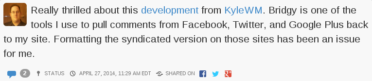
This is an example of a standard status update on the site. The blue icon is the comment icon, and next to it, linked to same, is the number of responses. I can’t help thinking that I don’t need both. But the rest of the line has an icon and information: Status and the Status Icon, the Time and a Time Icon, the Shared Icon with the icons of the sites I syndicated the post to.
If you look at this, which I classify as an article, not a status update, some of that information migrates to the top.
I also wanted to add a business card like area in the sidebar.
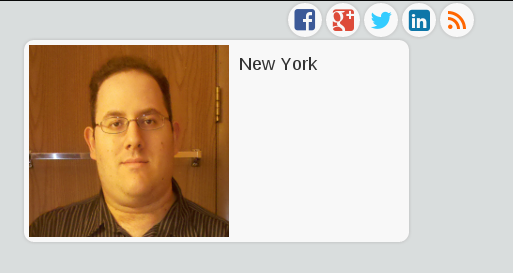
This is not a finished feature…but I’m innovating in public. I spent a lot of time on the other site, but this part is just temporary. You can see the icons that indicate places I syndicate copies of these posts to. I really like the look of those icons, however, they don’t quite fit on the full version on the site. It looks fine if it is on a phone(Yes, the site scales for mobile. Try it.)
Then we get to the profile box. The picture is too big. I probably need a new profile picture anyway, but I’m usually behind the camera, not in front of it. We’ll see what else I can do with this. I’ve been looking at other sites and how people do these sidebar bios.
There actually has to be a picture of me on the front page of the site, much as I don’t really want it, for syndication purposes. The photo is used as an icon for the link should anything I say be replied to elsewhere.
There will likely be more exploratory posts like this. So, here I am, worrying about the smallest detail. No wonder designers boast about chamfered edges and all sort of things users don’t normally focus on. I’ve never heard anyone say…”I see you picked Helvetica as your font. Great choice.”
More on exploring this to come. Feel free to comment on whether you want to hear about it or not. You can comment on the site or over on any of the syndicated networks. It will come back.
I finally got to the window at the post office, and a man walked in front of me and started to conduct business. I objected, he said, “I was right in front of you, brother.” Did I somehow walk through him to get to the front?