The last iteration used Twitter bootstrap. I built this one from the ground up. It’s still a work in progress, but putting it live while I build out more of the features.
Once again, testing a new design for my site.
The Definitive Location
The last iteration used Twitter bootstrap. I built this one from the ground up. It’s still a work in progress, but putting it live while I build out more of the features.
 On the 23rd of December, I completed a major update to this site, as part of a commitment to do so by 2015. I often forget to document these changes.
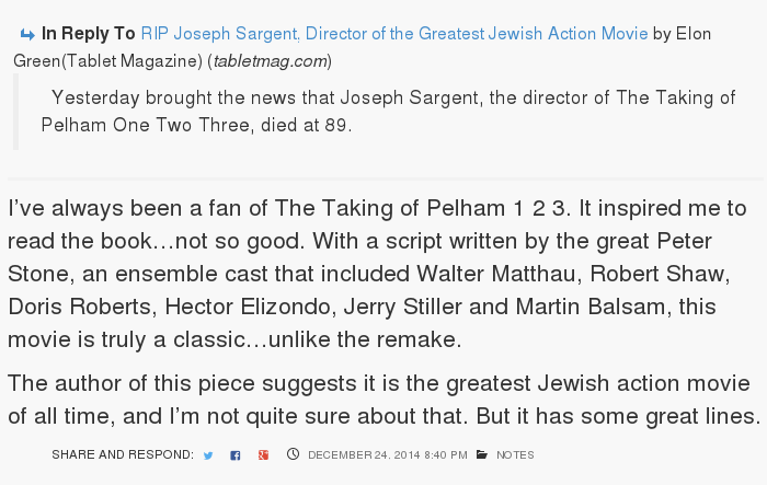
I redesigned and updated the portion of the post that shows what a post is in response to(for those that are in response).
Unlike the previous, this blends in with the background of the post itself, and adds in support for an author and profile picture.
I’ve captured two examples of that in this post for posterity.
More coming, but feedback is appreciated.
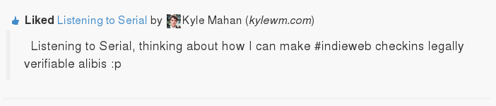
This is an example of a standard status update on the site. The blue icon is the comment icon, and next to it, linked to same, is the number of responses. I can’t help thinking that I don’t need both. But the rest of the line has an icon and information: Status and the Status Icon, the Time and a Time Icon, the Shared Icon with the icons of the sites I syndicated the post to.
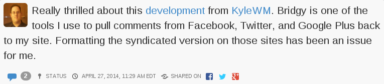
If you look at this, which I classify as an article, not a status update, some of that information migrates to the top.
I also wanted to add a business card like area in the sidebar.
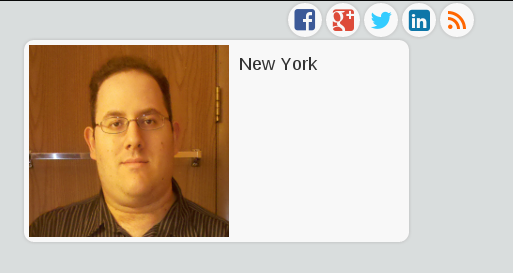
This is not a finished feature…but I’m innovating in public. I spent a lot of time on the other site, but this part is just temporary. You can see the icons that indicate places I syndicate copies of these posts to. I really like the look of those icons, however, they don’t quite fit on the full version on the site. It looks fine if it is on a phone(Yes, the site scales for mobile. Try it.)
Then we get to the profile box. The picture is too big. I probably need a new profile picture anyway, but I’m usually behind the camera, not in front of it. We’ll see what else I can do with this. I’ve been looking at other sites and how people do these sidebar bios.
There actually has to be a picture of me on the front page of the site, much as I don’t really want it, for syndication purposes. The photo is used as an icon for the link should anything I say be replied to elsewhere.
There will likely be more exploratory posts like this. So, here I am, worrying about the smallest detail. No wonder designers boast about chamfered edges and all sort of things users don’t normally focus on. I’ve never heard anyone say…”I see you picked Helvetica as your font. Great choice.”
More on exploring this to come. Feel free to comment on whether you want to hear about it or not. You can comment on the site or over on any of the syndicated networks. It will come back.