Last Updated
Map Welcoming in the New Year with the crew and passengers of JetBlue flight 1472 bound for New York.
Thinking about Mary Tyler Moore
I’ve been a fan of Mary Tyler Moore for a long while. The Dick Van Dyke show, where she was a supporting character, and the Mary Tyler Moore show where she starred. I even remember her appearance on Shalom Sesame, which I found this Youtube clip of.
The laughs aside, the thing that stays with me out of her body of work the most is the end of the Mary Tyler Moore show. In the show, a new manager has arrived and wants to do something about the low ratings of the news program the characters produce. He fires the production staff, but keeps the on-air talent…a well meaning type known for flubbing his lines. The same individual tries to write his own goodbye to his friends, deciding that the right words are, for reasons unknown, “It’s a Long Way to Tipperary, it’s a long way to go.”
The scene is one of the most memorable in TV history, with Mary’s character expressing that a group of people who work together, who spend time together…become like your family. Despite all of the sadness in the scene, the characters leave their office…their home away from home…for the last time, heads held high, singing. There is a lesson in that scene that resonated with me.
It’s a long way to Tipperary. It’s a long way to go.
After three days, I have given up on directory by genre and am going solely with artist. Meanwhile, I am still trying to fix the genre settings for music players that use them. Allan Sherman is not genre Christmas. The Beatles are not Data. Someone contributed this data to a service. I’m not sure if they were not messing with me.
I have organized much of the files, but it looks like I’ll have to do an audit of all music I backed up from CD, because the auto-organizing tools seem to have reclassified a lot of material. But, for now, I’m pausing with forty-nine gigabytes worth of MP3s and a lot more tagging. Organization is frustrating.
My 2017-01-01 Commitment – Location Support Returns
This post, for example, is set as if it was made at the Empire State Building.
Coming in the future is venue support. A venue is sort of the location equivalent of a bookmark. There are other names for it. It would allow more information about the location, and you would be able to view all posts associated with that location. This leads to what has become common on social media sites…the check-in. I used to store more information about the location in the post, and won’t be doing this anymore.
More to come on location and more, but I’m glad I got a version of this out. Thanks to Chris Aldrich for testing this out.
Location Support
Once again, unveiling new features for the site. WordPress does not have built-in location support for posts by default. There is a Geolocation plugin that is not actively maintained and does not support HTML5 geolocation, which allows me to click a button and have the coordinates retrieved.
For those interested, the plugin, known as Simple Location, is now available for download in the WordPress Repository.
The map and address information are courtesy of OpenStreetMap.
Music video for “Hasmonean”; a parody of Hamilton,; originally by Lin-Manuel Miranda
Winter Doo Wop Explosion
- The Jarmels
- Kid Kyle
- Barbara Harris and The Toys
- Vito Picone and The Elegants
- Jay Siegel’s Tokens
- Cancelled: Lenny Dell and The Demensions
I’ve been a fan of 50s music since I became fond of the classic movie, Back to the Future, as a child, and came to listen to a lot of music from that era.
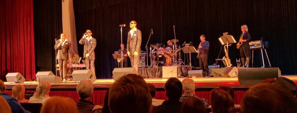
The audience was also from that era. The majority of people there were of an older bent. The Jarmels were only 33% original, and 66% replacement. But I am always struck by the performances by doo wop groups, and what they do with their hands and feet while performing…something you can’t hear in the recording. The Jarmels only had one hit, A Little Bit of Soap.
Kid Kyle was one of the youngest people there, except me. Of course, he got paid. He’s just under 22 and has been singing doo-wop since he was 8. It is nice to see that these songs will not die with their originators and original fans.
The Toys were formed in 1961 in Jamaica, Queens. Barbara Harris, the lead singer of the Toys, is still actively touring with two younger musicians. While it was my least favorite act, mostly because I found the pitch painful because I was too close to the right speaker( 5 rows from the front), Harris was impressive in the energy she is still able to convey. She had several Senior Citizens dancing in the aisles.
The Elegants also only had a single hit…Little Star, which Vito Picone recorded when he was 17. Now 75, he and the remaining Elegants performed not only that song, but a doo-wop cover of Ray Charles’ Georgia(Picone oddly put on dark sunglasses for that), as well as several other songs.
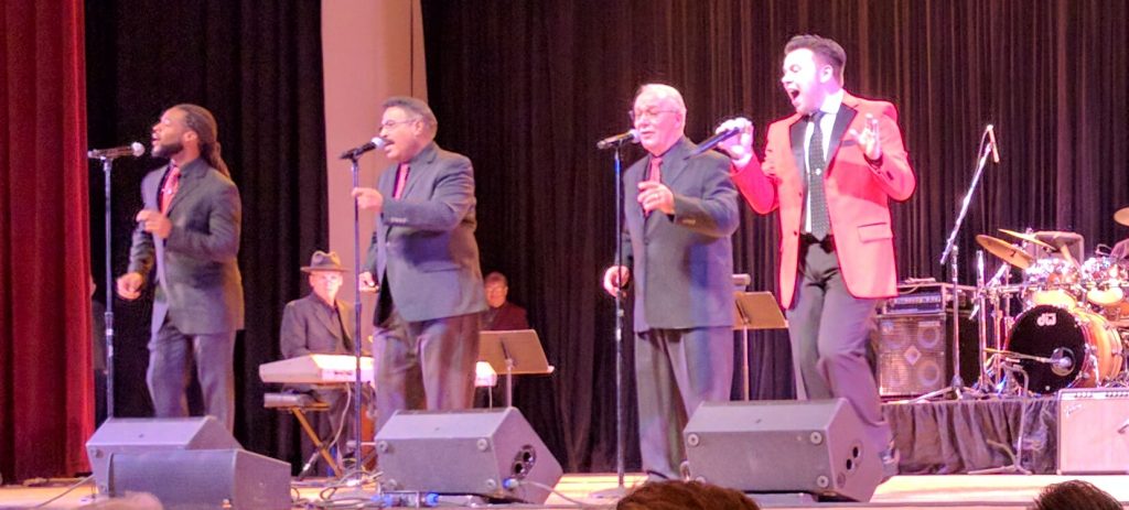
Finally, the Tokens appeared. Out of these groups, I had seen the Tokens perform before. Their version of The Lion Sleeps Tonight, with Jay Siegel still able to hit the high notes he hit in 1961 is still impressive, and despite other recordings predating it, is generally the best known version of the song.
The group started in Brooklyn, and Neil Sedaka was one of its early members. The Tokens also produced other musical acts, such as the Chiffons, Randy and the Rainbows, the Happenings, etc.
For anyone interested in their next concert, the same production group is bringing Vito Picone back, along with the Happenings, the Marcels, The Tymes, and The Excellents on Saturday, March 25th, 2017 at 7:30PM, also at the Colden Auditorium at Queens College. Call 718-423-8394 for more information.
The event was also the first I brought my new 360 degree camera to. It is interesting to take a video where you can see not only the audience, the performers…but me reacting to them. That’s a bit too much me in the shot. I like a bit more subtlety.
But there is some part of me that wishes random people still formed doo-wop groups. Part of me would enjoy the experience of singing with one at least once.
CBS’s Elementary Gets Kosher Wrong
The episode that aired last night, entitled, How the Sausage is Made…has Sherlock Holmes coming up with a conspiracy where there is a enough profit in the FDA classifying artificially grown meat as a ‘meat substitute’ instead of as meat to allow Jews to eat cheeseburgers and Muslims to eat pork that someone would kill to ensure it.
During the course of the episode, Holmes tries to explain kosher law, among other things….that food is broken out into meat and dairy, and a third category that is neither…one he calls Parevah. I usually say Pareve, but even par-veh is correct. I’ve never heard anyone call it pareva, to be honest and I asked around this evening. There isn’t one person who could look up the common pronunciation. One would assume the character might be wrong, but in the scene he had just met with some rabbis discussing the issue, so he should have just heard it. On the other hand, if you google pareve, and click the pronounciation, it pronounces it paravah also, I embedded Google’s pronunciation below. Either someone tell me they’ve heard it pronounced as three syllables or someone at Google please correct it.
Perhaps in a universe where the Convocation of Orthodox Rabbis(I’m assuming as a stand-in for the OU, the Orthodox Union) exists, the issues are different. I confess to not be as familiar with the Halal certification bodies in the U.S. but I am fairly familiar with the kosher ones.
So in the end, Holmes and Watson lead the murderers to believe that the bodies that certify kosher and halal food will, because of the suspicious murder, never certify the artificial meat as ‘pareva'(sorry, it just annoys me) and that the whole murder would therefore be pointless as the product would be relegated to the vegan aisle. And if someone confeeses to the murder, the rabbis and the imams will change their mind because ‘murder is not kosher.’ I would hope that the two characters are lying through their teeth, but I would hope that two individuals who are counting on a big payday from kosher and halal sales would know better the issue if they are going to kill for it.
The truth of the matter is that the issue of whether meat grown in a lab would be considered not to be meat, and thus not subject to the prohibitions of keeping meat and dairy separate is not an issue so clear cut for many reasons, so it would not be something that they would hold over the heads of would-be murderers like a business transaction. If you just search for kosher artificially grown meat, the first few entries lay out how much debate would be necessary to settle the issue. And in my personal opinion, it is much more likely to be classified as meat.
That said, the suggestion that all Jews are sitting around, clamoring for the opportunity to find a loophole to eat cheeseburgers and other food which is not kosher(the same for Muslims) suggests an extreme level of cynicism.
I have to say, while television is often lacking in realism, and often poorly written, this seems to be a case of a writer trying to come up with a clever story, but failing to do five seconds of research to put the issue into a realistic perspective. And, while poor characterizations of Jews on television has always annoyed me, sloppy storytelling annoys me even more.
For reasons unknown as all she knew of him was from the newspapers, Sands believed in Arthur and wrote to him with advice and encouragement many times over the next few years. Some of the letters survive, including the first.
‘Your kindest opponents say ‘Arthur will try to do right’ – adding gloomily – ‘he won’t succeed though making a man President cannot change him.’…But making a man President can change him! Great emergencies awaken generous traits which have lain dormant half a life. If there is a spark of true nobility in you, now is the occasion to let it shine. Faith in your better nature forces me to write to you – but not to beg you to resign. Do what is more difficult & brave. Reform! It is not proof of highest goodness never to have done wrong, but it is proof of it, sometimes in ones career, to pause & ponder, to recognize the evil, to turn resolutely against it.“
She goes on later to write:
“How sad it must be for anyone to look back and feel that the best strength of their manhood has all been wasted on unworthy ends. For your own sake and for the sake of those who love you, do not fill your life with actions which afterwards bring you only regret. Go back to Washington – forget New York, political strife and personal animosity. Remember that you are President of the United States – work only for the good of the country. And bear in mind, that, in a free country, the only bulwark of power worth trusting, is the affection of the people.”
Arthur surprised people. Having been a direct beneficiary of the political spoils system, he nevertheless participated in dismantling it and pushing for civil service reform. Admittedly, there aren’t that many parallels between Donald J Trump and Chester A. Arthur, but the often forgotten legacy of Chester A. Arthur is that a man can be changed by the realities of the Presidency.
Fyvush Finkel Remembered
There is very little I can say about him that hasn’t been said already. Even as recently as last month, he was making the news with his declaration of support for Hillary Clinton. And every few months, since the picture below as taken, I would try to attend the Yiddish Artists and Friends Actors Club events, where he would act as the Master of Ceremonies.
He was active till the end and always full of enthusiasm, which is why, despite his age, I am surprised at the news.
The best we can do at a time like this is remember, so below is a excerpt I found of one of the YAFAC events I attended, telling one of his classic jokes.


