Oldest Posts
MapDesign Obsession
This is an example of a standard status update on the site. The blue icon is the comment icon, and next to it, linked to same, is the number of responses. I can’t help thinking that I don’t need both. But the rest of the line has an icon and information: Status and the Status Icon, the Time and a Time Icon, the Shared Icon with the icons of the sites I syndicated the post to.
If you look at this, which I classify as an article, not a status update, some of that information migrates to the top.
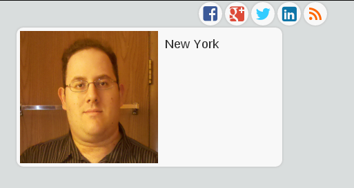
I also wanted to add a business card like area in the sidebar.
This is not a finished feature…but I’m innovating in public. I spent a lot of time on the other site, but this part is just temporary. You can see the icons that indicate places I syndicate copies of these posts to. I really like the look of those icons, however, they don’t quite fit on the full version on the site. It looks fine if it is on a phone(Yes, the site scales for mobile. Try it.)
Then we get to the profile box. The picture is too big. I probably need a new profile picture anyway, but I’m usually behind the camera, not in front of it. We’ll see what else I can do with this. I’ve been looking at other sites and how people do these sidebar bios.
There actually has to be a picture of me on the front page of the site, much as I don’t really want it, for syndication purposes. The photo is used as an icon for the link should anything I say be replied to elsewhere.
There will likely be more exploratory posts like this. So, here I am, worrying about the smallest detail. No wonder designers boast about chamfered edges and all sort of things users don’t normally focus on. I’ve never heard anyone say…”I see you picked Helvetica as your font. Great choice.”
More on exploring this to come. Feel free to comment on whether you want to hear about it or not. You can comment on the site or over on any of the syndicated networks. It will come back.
It had flooding, mudslides and stranded drivers.
The Toronto Public Library was asked to pull copies of "Hop on Pop" by Dr. Seuss because it "encouraged children to use violence against their fathers."
Memories
Something of a stupid mistake. Many of them were private at the time, and were supposed to come unpublished into the system for review. But, it is also evidence of how I’ve matured over the years, I suppose. You come to the realization of how you felt at different times in your life, which is why I moved the old entries in the first place.
It reminds me of why my sharing on the internet is so limited. Once you say something, you can’t unsay it, or delete it.
The song has been stuck in my head today. With the song, Dylan comments on what he once accepted and now doubts, and to a degree, celebrates where he is now.

Getting Started with the Indieweb – Part 1

I’ve lately, if you’ve been paying attention to this website, gotten started with a movement called the Indieweb movement. To remind you from last time I mentioned it, the ideas of the movement are:
- Your content is yours
- You are better connected
- You are in control
So, I figured it would be a good idea to write a simple tutorial in case you want to join on this. If you visit the indiewebcamp site, there is a wealth of information. But it seems overwhelming to some. This is my version of things, where I focus on it from the perspective of a non-techie typ. A large portion of the indieweb is about markup. Basically, marking up the elements of your site so they can interoperate with other sites.
- Get your own domain name and web hosting. If you want to own your content, you need to rent a place to put it.
- Put Up a Site. Will cover more of this. I use WordPress as a platform, which is very simple to set up.
- Add Links on the Site to Your Social Network Profiles and Links on your Social Network Profiles to Your Site. These should be marked up with a property called rel-me. This allows you to effectively say that Facebook you, or Twitter you is the same person as your new site, and vice versa. Both have to point to each other to avoid spoofing.
- Put up a Bio/About Page – Good to tell people who you are.
- Start publishing. What is the point of a worrying about some of this other stuff if you have nothing there.
The above doesn’t get into all the markup I mentioned. This is staking your claim for your little piece of the web. Next, I’ll get into the ‘cooler’ stuff. I’m really enjoying getting involved in this.
This site is running WordPress, which is used by roughly 20% of websites. A lot of the functionality I mentioned, as well as what I’ll be talking about on this in the future, can be put into WordPress using plugins. This includes things like syndicating content to other sites and importing content from those locations. It has given me an excuse to start developing and redeveloping code to support this.
So, some of those who follow me may find me being a bit more techie than normal.

Making Fun of SEO Optimization Offers

I got a comment on the sharing of a link on rainy weather in NYC. So…it was just the link and a short comment on it. It was not an article.
Hello Web Admin, I noticed that your On-Page SEO is is missing a few factors, for one you do not use all three H tags in your post, also I notice that you are not using bold or italics properly in your SEO optimization. On-Page SEO means more now than ever since the new Google update: Panda. No longer are backlinks and simply pinging or sending out a RSS feed the key to getting Google PageRank or Alexa Rankings, You now NEED On-Page SEO. So what is good On-Page SEO?First your keyword must appear in the title.Then it must appear in the URL.You have to optimize your keyword and make sure that it has a nice keyword density of 3-5% in your article with relevant LSI (Latent Semantic Indexing). Then you should spread all H1,H2,H3 tags in your article.Your Keyword should appear in your first paragraph and in the last sentence of the page. You should have relevant usage of Bold and italics of your keyword.There should be one internal link to a page on your blog and you should have one image with an alt tag that has your keyword….wait there’s even more Now what if i told you there was a simple WordPress plugin that does all the On-Page SEO, and automatically for you? That’s right AUTOMATICALLY, just watch this 4minute video for more information at.
So, according to Mr. Spammy SEO type, I should spread an H1, H2, and H3 tag in my article. Let’s convert that into English. I should have three levels of headings. Title, subtitle, section?
Then, I should have a keyword in my title and it should appear in the first paragraph and last sentence of the page. This would be basic advice on non-fiction writing dating back long before Google. The title of your article should be relevant to your topic(or keyword). Your first paragraph should set out the point of your entire article. The last sentence of your article should summarize the point you tried to make.
It then tells me there should be an image with an alt tag that has the keyword. Well, people respond to images. I always try to find a random image(and I have a plugin that helps with that) to add a little color. I probably should start searching my own photo archives for photography.
So…what if there was a plugin that could make me more popular, regardless of how horrible my writing is? I think I’ll just try to write well, thank you very much.

Thinking about Social Buttons
Semantic Comments and User Testing
But since, I’ve been systematically dismantling everything I built. Not quite. I’ve been taking the theme and breaking off pieces of it into independent plugins. The first of this is the Semantic Comments plugin. This is an extension of the facepile code I created. Facepiles are a row/rows of profile photos of individuals who have completed an action related to the current page…such as Like, Mention, Repost, etc.
It gave me the chance to do something even more geeky. I posted my code to Github. You can visit the repository and download it, criticize it, comment on it, at Semantic Comments. A professional programmer friend of mine told me that you never stop being convinced your code is garbage.
But, one of the more recent decisions I made for this plugin, and thus my site, was inspired by the words of Kartik Prabhu on his site, Parallel Transport, in an article called, “No Comment.”
“Why this expectation that every blog must be a discussion forum? Public discussions can be had on social platforms like Facebook, Twitter, Google+”.
So, comment over there, and I’ll pull your comments in back here. I’ve automated it and it is no trouble. Or comment on your own site. But this is something of a novel idea for people. So I took the comment form out. It was only one line of code anyway. I could change my mind later, I guess.
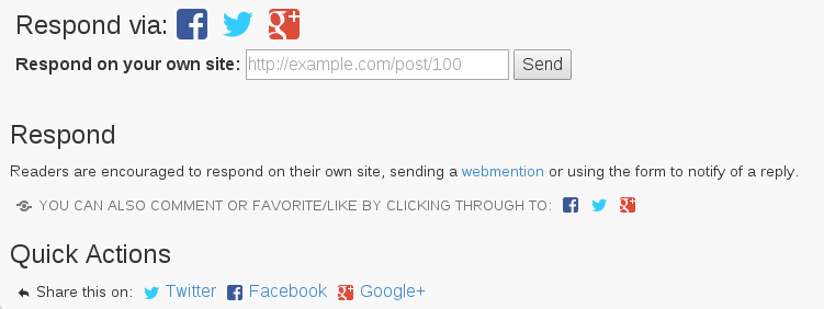
So, at the bottom of the post, you’ll see some options.

Then, below the comments, you’ll see…

If it is a full article, you’ll see different Quick Actions. The Favorite, Reply, Repost ones go to Twitter. They are the only ones who support this sort of link without demanding I use their social buttons…you know, the ones everyone has.

I rearranged the order, I fiddled with the text …and I asked a lot of people if they’d have a look at my test site to see if they understood it. Some of you may have been in that group.
I still haven’t found the magic bullet. Some people told me they thought they needed to paste whatever the link they commented on into the box. Others weren’t sure how they’d respond. It is proof that any new way of doing things may contain a barrier in adoption.
You may have noticed that Twitter, Facebook, Google+, etc all are starting to look very similar. One reason seems to be that people instantly are familiar with portions of the layout.
I’m continuing to iterate, change, try to find the best way to do things, but this is where user testing comes into place. What is missing…what could be better…how can I have the simplest presentation possible with the elements I have?
Thoughts?

