On Sunday evening, we arrived at Kibbutz Lavi. Kibbutz Lavi’s hotel facility is one of their main sources of income and popular with Orthodox Jews. They also make synagogue furniture and engage in the traditional Kibbutz business of agriculture. Agriculture is no longer the primary business of any kibbutz, from what I understand.
Compared to the two hotels I visited, the room was nice, the wifi at the Kibbutz was good, the staff was friendly, and the food…left a bit to be desired. The eggs were powdered, for example. It seemed to be more like a public school cafeteria.
Tzfat was the first stop on Monday. It is the highest city in Israel in terms of elevation. The Jewish presence in the city dates back to the Middle Ages. After the Spanish Inquisition expelled the Jews from Spain, it became a center of Jewish learning, and is considered a center of Kaballah even to this day. Notably, Joseph Caro, the author of the Shulchan Aruch and Shlomo Halevi Alkabetz, composer of Lecha Dodi, which is sung as part of the Friday evening service.
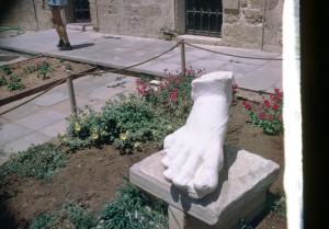
In Tzfat, we visited a gallery of artwork by Nicky Imber. Imber was an artist who was so skilled, when at Dachau, he’d been able to make a mask out of break and sand of one of the Nazi soldiers, steal a uniform, and walk out of the gates of the camp. His sculptures are still famous worldwide.

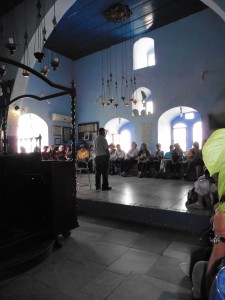
We then visited the Joseph Caro synagogue, built in the 16th century, and rebuilt after a 1759 and an 1837 Earthquake. It was originally a place of learning, and didn’t become a synagogue until 1903.

The other synagogue visited was the Ha’ Ari Synagogue, built in honor of Rabbi Isaac Luria, the Ari. It may be the oldest synagogue in Israel still in active use. The distinction is questionable, because there are many repeatedly destroyed synagogues that have been rebuilt, in some cases after many years of destruction, including the Karaite Synagogue in Jerusalem.
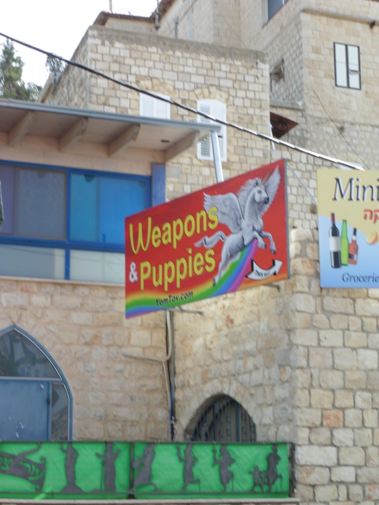
After touring both, we wandered around the Artist’s Quarter…otherwise known as random people trying to sell us things. There were some nice items, but nothing so nice I could see myself hauling it around for a week to bring home. The most surprising part was a woman who greeted us “Good Morning” and called me out when she didn’t hear my low and noncommittal response. It turned out, by odd coincidence, when we did speak to her, she had grown up in Westchester and had gone to school with my cousin. Small world.
Later that day, we headed toward the Golan Heights, taking a jeep tour of the area. And when I say a jeep tour, I mean it. Bumpy unpaved roads, dust flying everywhere(and me wearing a dark shirt that day)…certainly an experience.

And then we get to the Jordan River. There it is….surprisingly tiny, isn’t it? I’m assuming that when Johnny Cash sung about waiting on the Far Bank of the River Jordan…he hadn’t seen it.
The Jordan River is 156 miles long, running from its sources to the Sea of Galilee, and then a lower section down to the Dead Sea. South of the Sea of Galilee, it forms the border between Israel and the Kingdom of Jordan. The flow of the Jordan has been sharply reduced by Israel, Jordan, and Syria. Prior to the Six-Day War, in 1965, Syria, Jordan, and Lebanon attempted to divert some of the sources of the Jordan River in order to reduce Israel’s water supply.
 I remember visiting the Golan Heights the last time I was in Israel. And I remember signs like these, and being told that they still, years after the Golan Heights were captured in 1967 and annexed in 1981, the mines were still a threat. The Heights are a plateau, from which the Syrian Army attacked Israeli communities in the valley below by firing artillery shells. Without getting into the politics of it, which date back to 1923, returning the Golan Heights to Syria would leave Israel at significant risk.
On June 6th, 1967, Syria launched three attacks against Israeli positions. On June 8th, 48 years to the day that I was there, the Israeli Air Force bombarded the Syrian positions on the Golan Heights.
After 16 years, it is hard to reconstruct the last trip I took here, but it was part of the March of the Living, and I was asked to take notes. I’ve pulled what I wrote that day, after writing my recollection of the more recent trip.
Tuesday, April 20, 1999 – We had gone up the mountain in jeeps, and also returned that way for a nature hike, which was cut short. Bret Gutstein once again appears in this document, hitting me with a large piece of bamboo.
I looked up Bret Gutstein…I believe she is now running a bagel seasoning business in New York.
More on 1999 later, especially since, combining all this material makes me think my narrative here is going to last a lot more parts…we haven’t even reached Jerusalem yet. I had forgotten I still had this notebook till I was writing about the Golan Heights.
Next time on Israel….we visit the the Memorial at Mitzpe Gadot, the Banias Springs, and Tel Hai. And more…Israel: Then and Now.


