Attending this event: yes
Week: 22
MapA restaurant whose entire bathroom-related theme — complete with toilets as seats, dishes with hilariously fecal names, and miniature toilet-shaped bowls for your food — seems to have b…
Semantic Comments and User Testing
But since, I’ve been systematically dismantling everything I built. Not quite. I’ve been taking the theme and breaking off pieces of it into independent plugins. The first of this is the Semantic Comments plugin. This is an extension of the facepile code I created. Facepiles are a row/rows of profile photos of individuals who have completed an action related to the current page…such as Like, Mention, Repost, etc.
It gave me the chance to do something even more geeky. I posted my code to Github. You can visit the repository and download it, criticize it, comment on it, at Semantic Comments. A professional programmer friend of mine told me that you never stop being convinced your code is garbage.
But, one of the more recent decisions I made for this plugin, and thus my site, was inspired by the words of Kartik Prabhu on his site, Parallel Transport, in an article called, “No Comment.”
“Why this expectation that every blog must be a discussion forum? Public discussions can be had on social platforms like Facebook, Twitter, Google+”.
So, comment over there, and I’ll pull your comments in back here. I’ve automated it and it is no trouble. Or comment on your own site. But this is something of a novel idea for people. So I took the comment form out. It was only one line of code anyway. I could change my mind later, I guess.
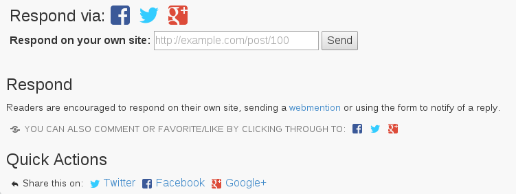
So, at the bottom of the post, you’ll see some options.

Then, below the comments, you’ll see…

If it is a full article, you’ll see different Quick Actions. The Favorite, Reply, Repost ones go to Twitter. They are the only ones who support this sort of link without demanding I use their social buttons…you know, the ones everyone has.

I rearranged the order, I fiddled with the text …and I asked a lot of people if they’d have a look at my test site to see if they understood it. Some of you may have been in that group.
I still haven’t found the magic bullet. Some people told me they thought they needed to paste whatever the link they commented on into the box. Others weren’t sure how they’d respond. It is proof that any new way of doing things may contain a barrier in adoption.
You may have noticed that Twitter, Facebook, Google+, etc all are starting to look very similar. One reason seems to be that people instantly are familiar with portions of the layout.
I’m continuing to iterate, change, try to find the best way to do things, but this is where user testing comes into place. What is missing…what could be better…how can I have the simplest presentation possible with the elements I have?
Thoughts?
